Strategy and creative content for Bodycam 4 body‑worn cameras.
Objective
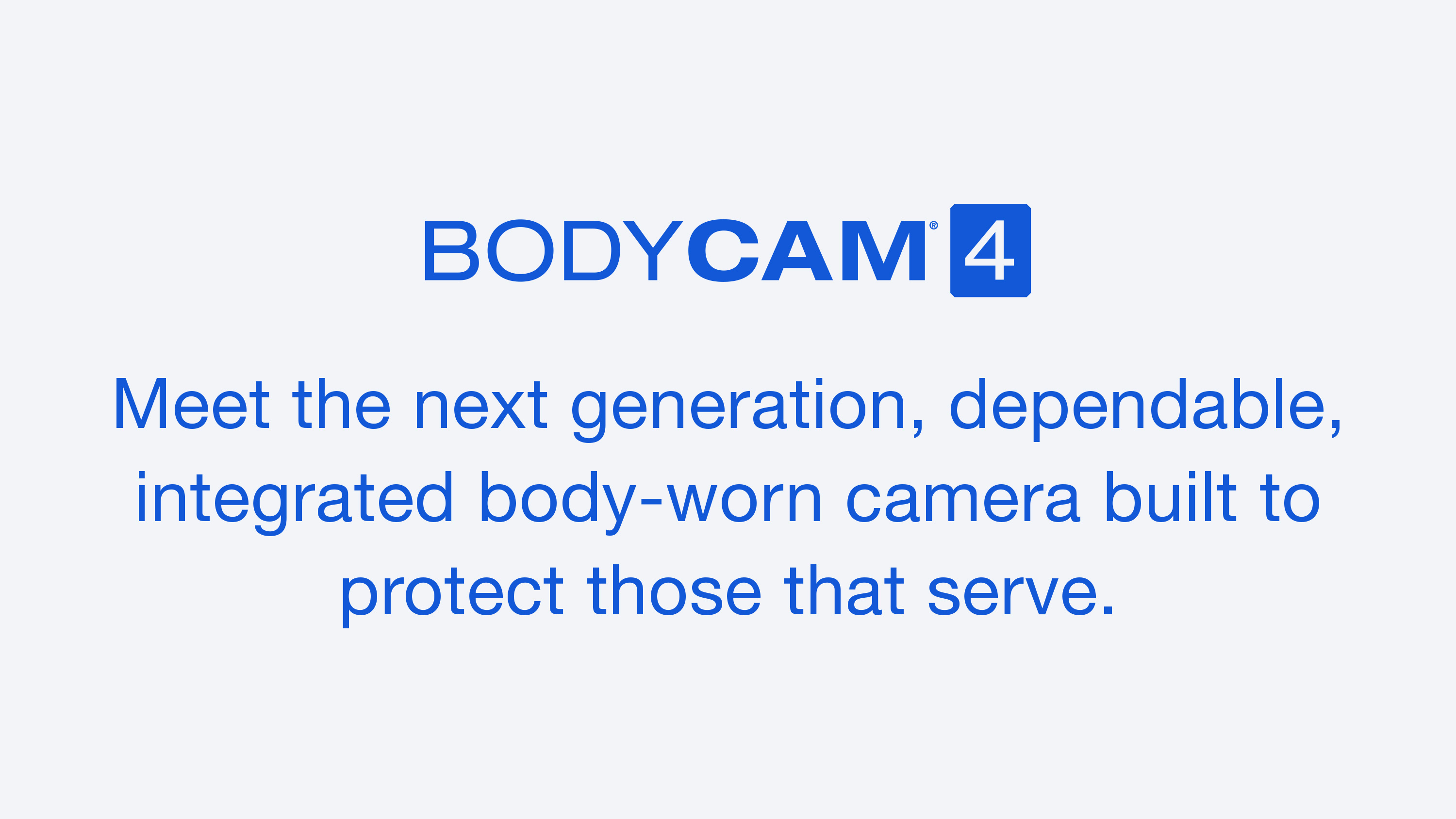
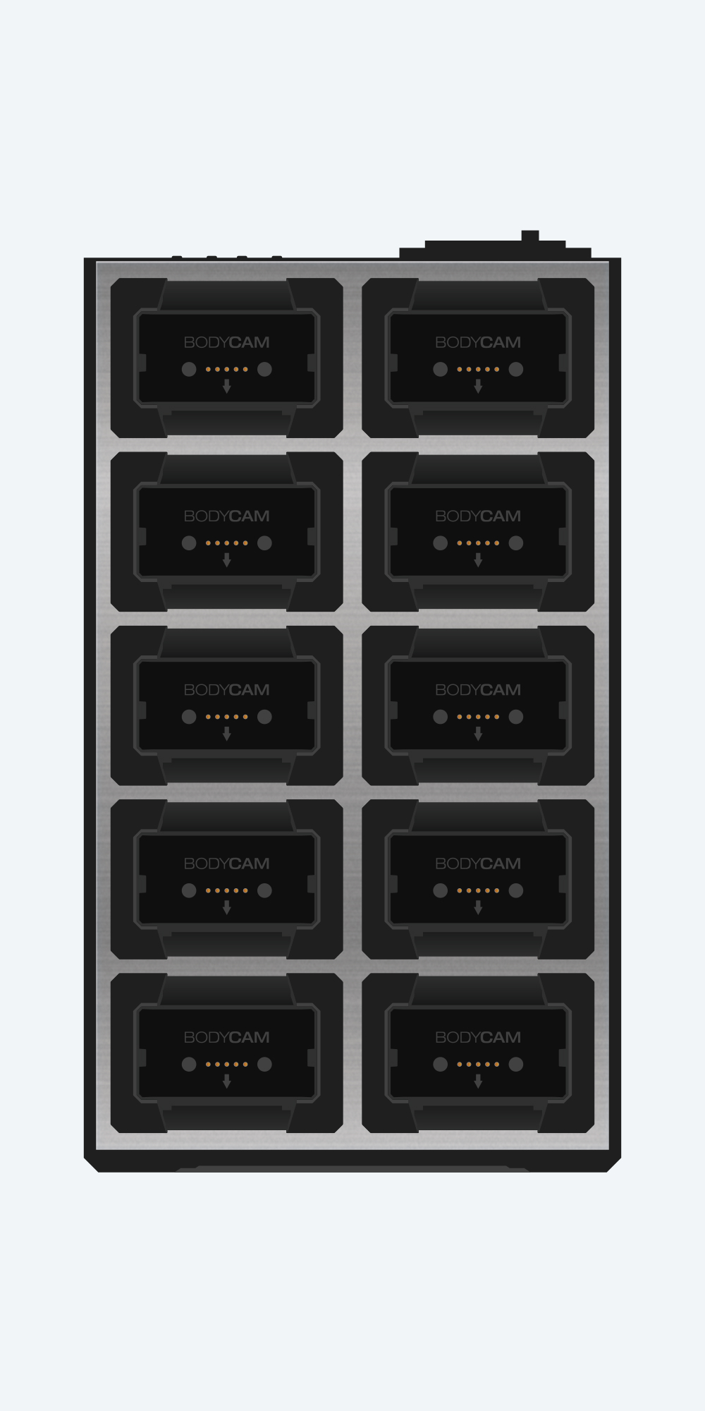
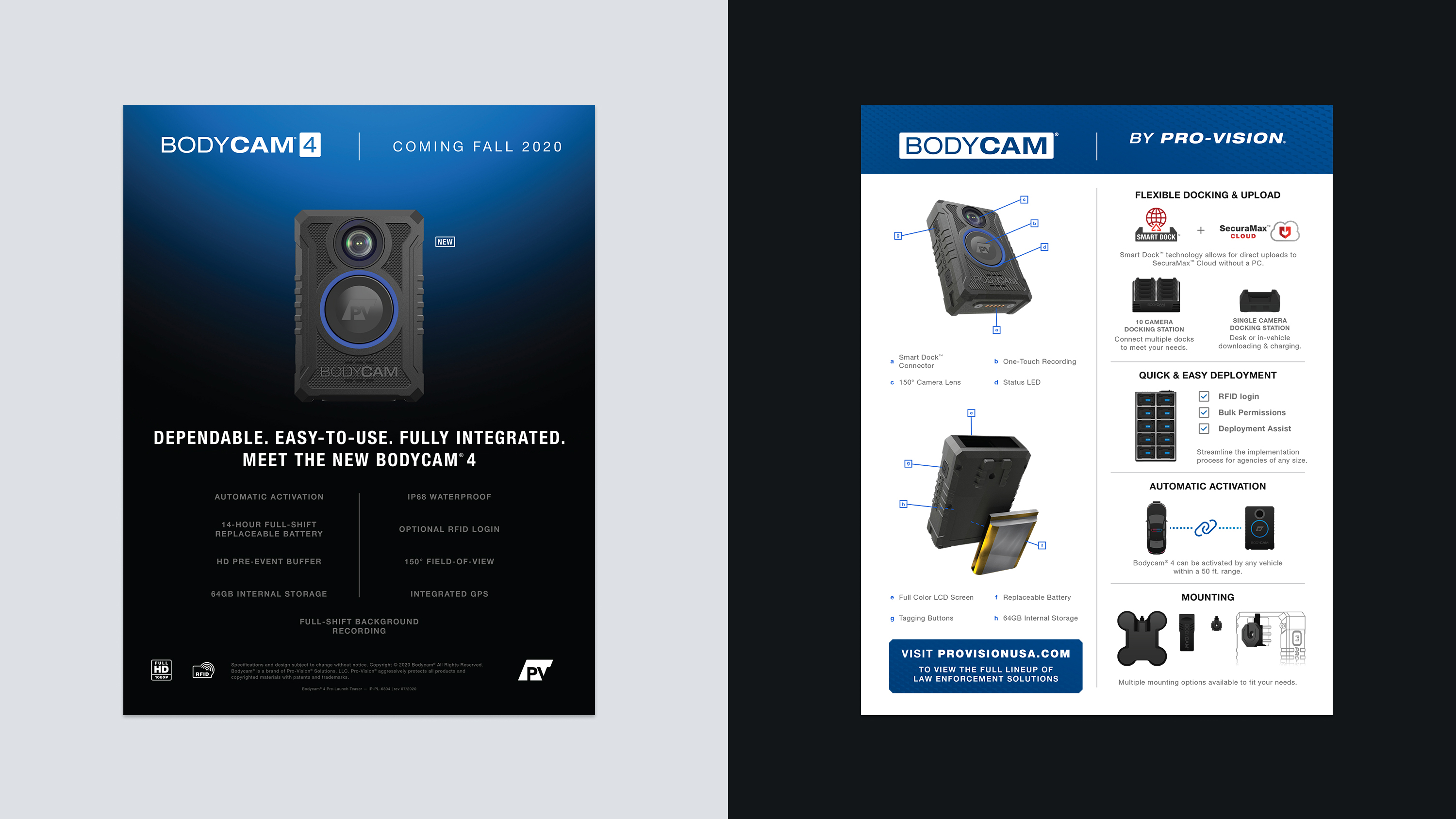
In the fall of 2020 Pro-Vision launched Bodycam® 4. The rollout was encumbered by part supply and scheduling hurdles. Due to these challenges the development of the initial merchandising materials had an abbreviated timeframe. The materials were conceived and delivered in approximately three weeks.
I spearheaded the creation of a brand identity, product/feature illustrations, ancillary logos, printed teaser document, and website creative content.
Approach
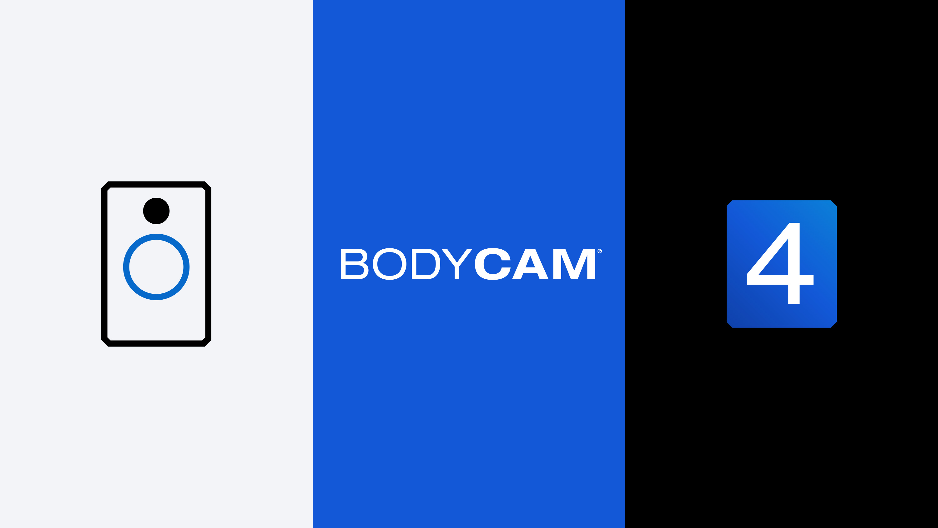
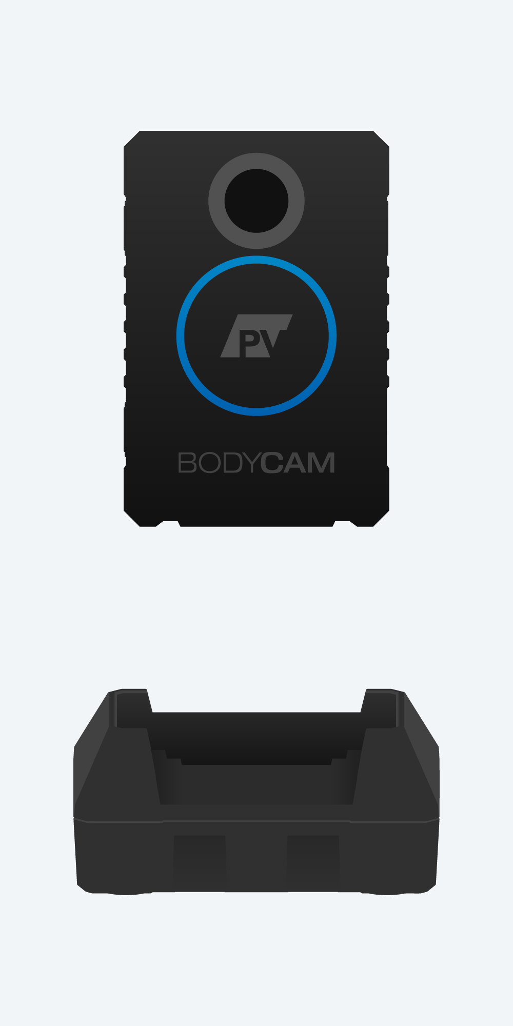
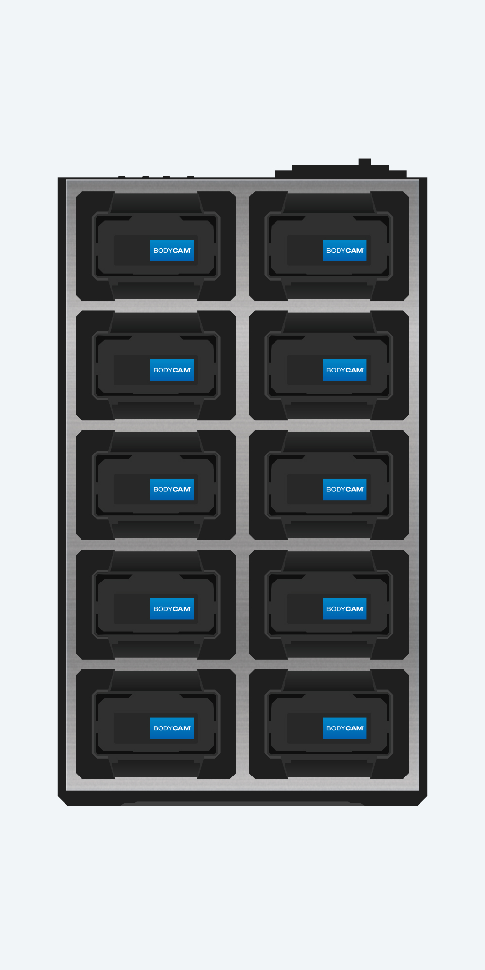
The hardware design of Bodycam 4 was defined by the Engineering team and used the “BODYCAM” name mark from previous models. For the new brand identity, the name mark was re-done with thicker weights of Helvetica Neue. It was close to the already defined hardware and an aesthetic improvement.
The Bodycam’s chamfer corners were a design element chosen to feature prominently in the identity system. The identity uses a chamfer corner box that represents an abstract silhouette of the Bodycam. The corners are maintained across variations with the name mark enclosed by a rectangular box.
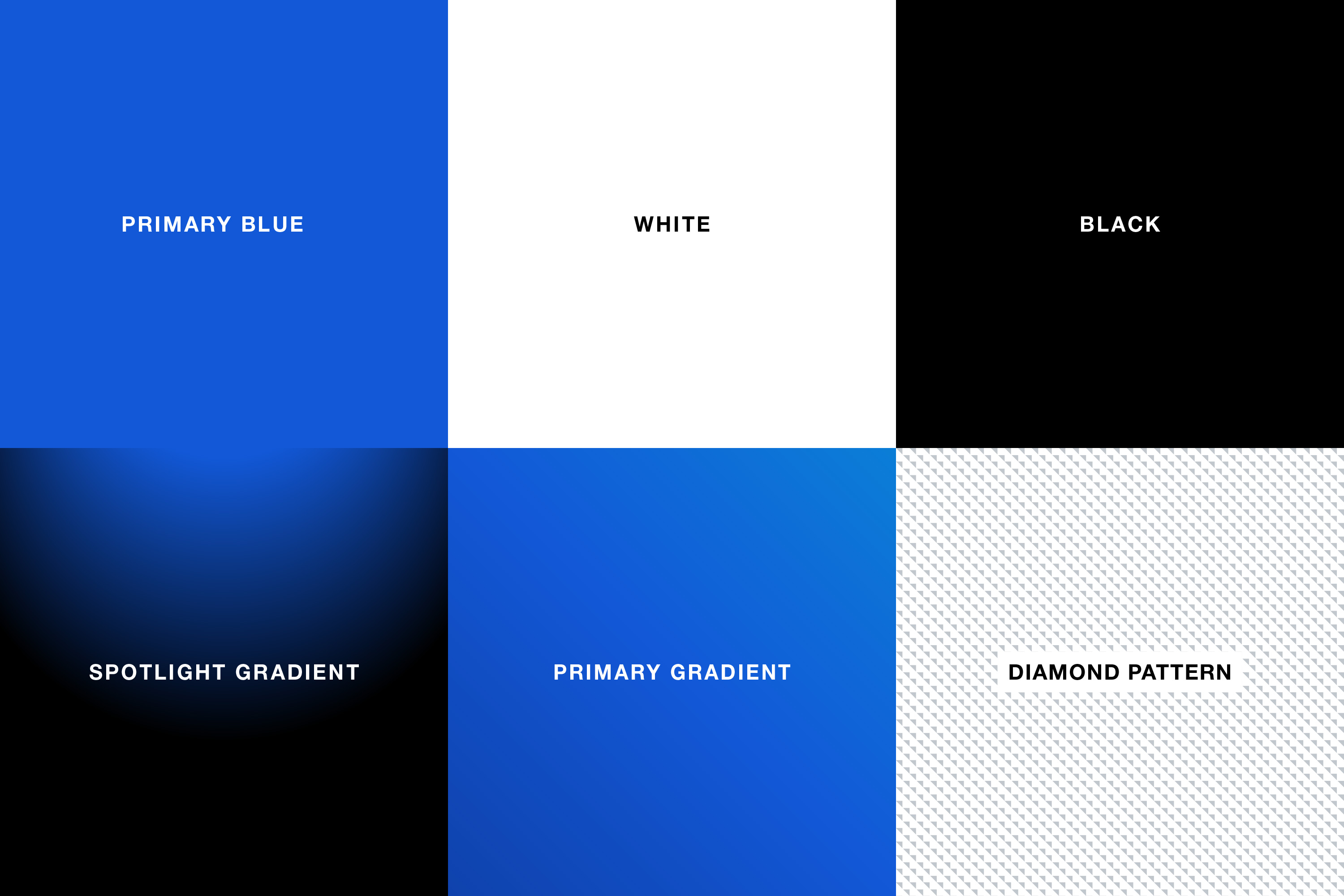
Blue was kept as the primary color, albeit a more vibrant hue. New gradients were created for use on the logos and backgrounds. A diamond pattern was derived from the stippling texture found on the front of the camera.
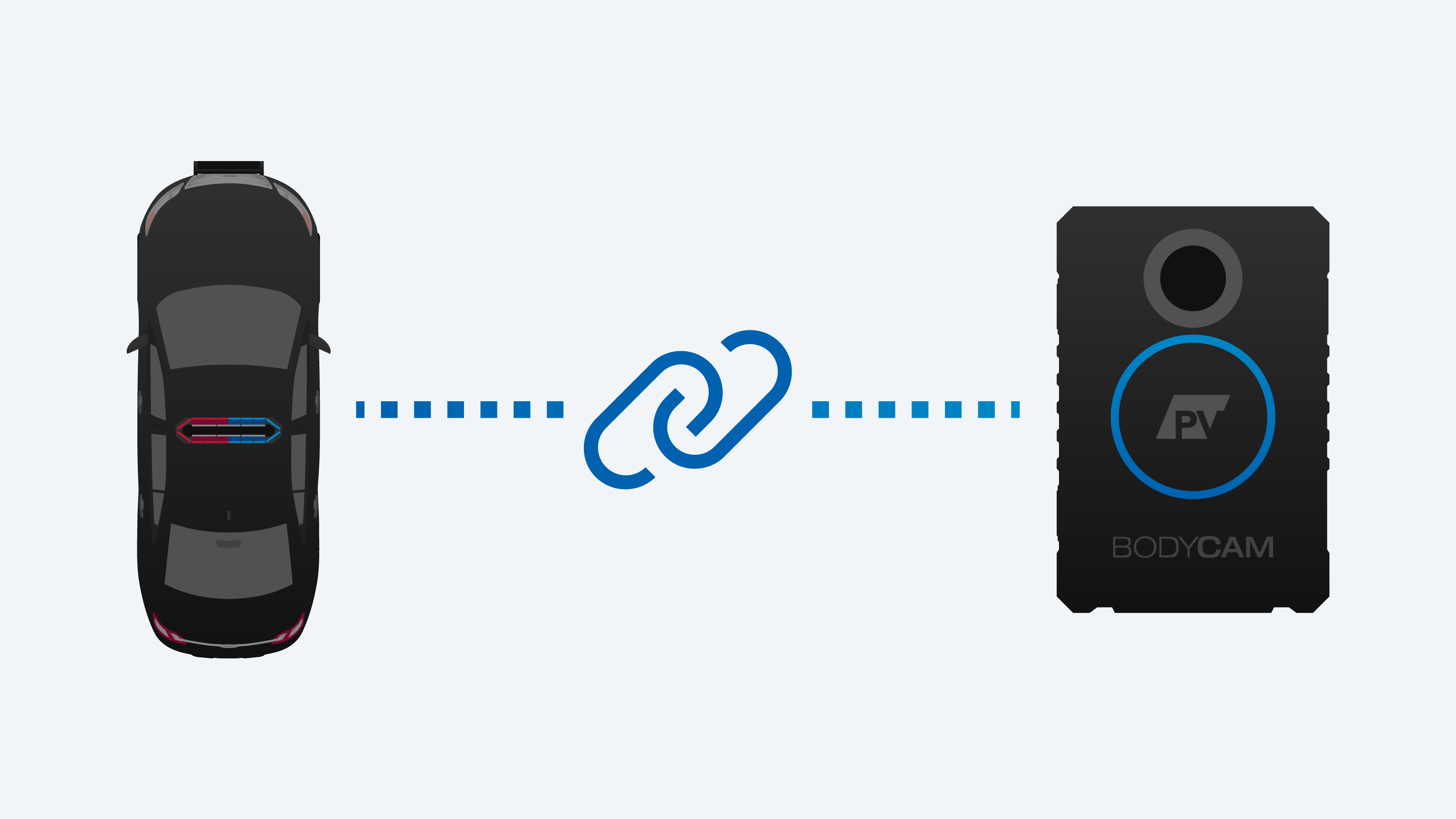
Bodycam has several logo variations with knocked-out letterforms reminiscent of Pro-Vision’s “PV” parallelogram logo. This helps the logos to read as a family when shown together.
What we achieved
The well thought through and executed identity system helped to get merchandising materials put together quickly and with an elevated aesthetic. The Sales team members were especially enthusiastic with the initial materials and design direction. They recognized it as a huge step-up from what was used previously.
A leader in mobile video, software and telematics. They engineer, manufacture, supply and install systems for commercial, law enforcement and transit markets.