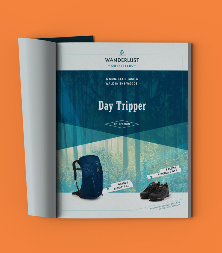
A new identity for west Michigan based outdoor apparel and gear retailer.
Previous
Revised
Previous
Revised
Objective
While developing a proposal for speculative freelance work, I saw the opportunity to vastly improve their branding with a refined logo and type treatment. Their current branding features a pitched A-frame tent used as a standalone emblem and as the letter “A” of their name mark.
Challenge
The current typeface Operina Romano P22, used for “WANDERLUST,” is very limited in its character set and has a rough, unrefined aesthetic. A case could be made for utilizing this aesthetic for an outdoor gear retailer, the reality is that it presents many challenges when trying to create harmonious compositions for all use cases. The tent graphic did not share the same rough edges, creating a discontinuity. I set about to explore alternate typeface options to find letterforms conducive to recreating a harmonious tent graphic.
Approach
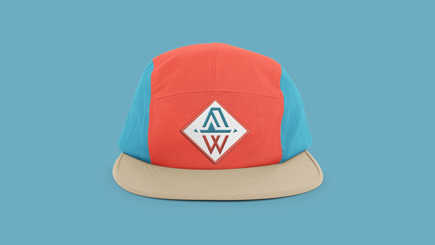
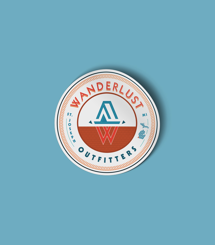
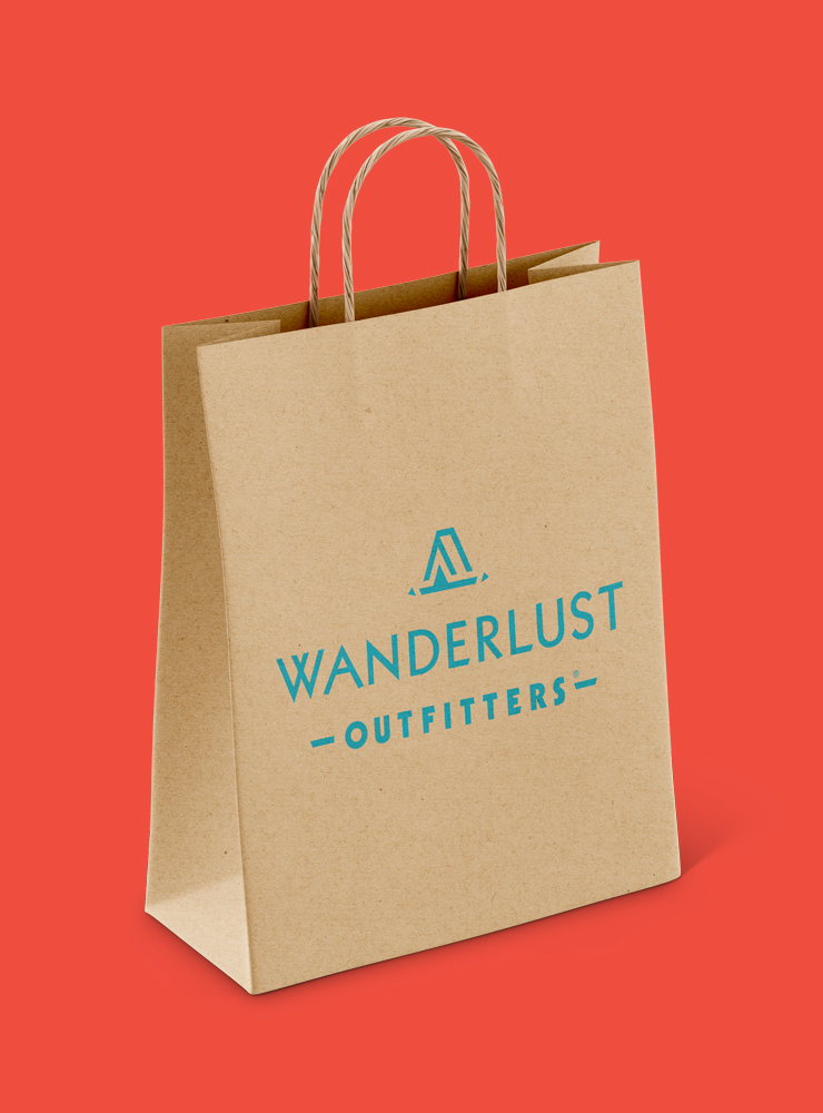
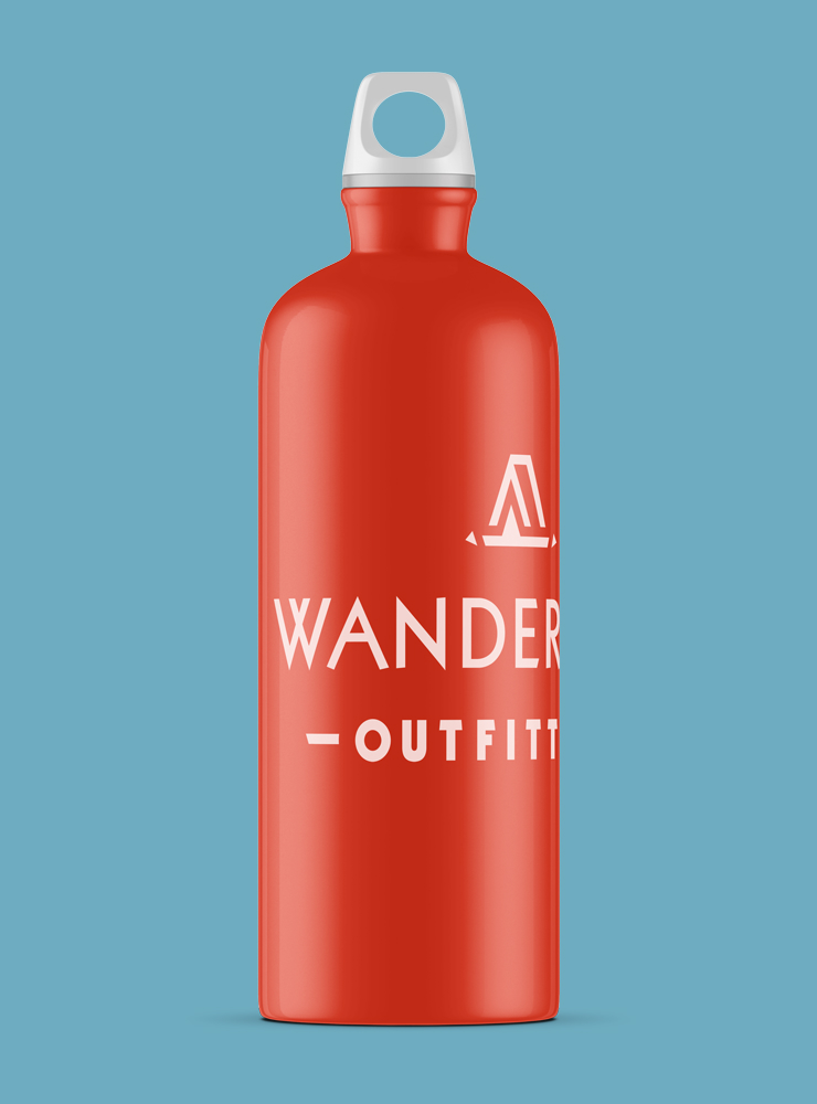
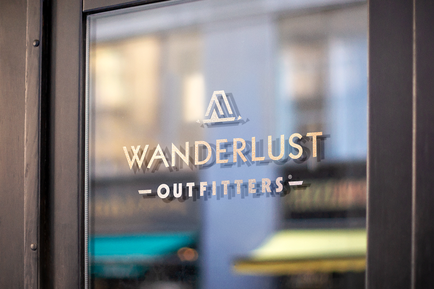
Kabel Heavy was used as the primary typeface and Kabel Black as the secondary. Kabel is a geometric typeface with pronounced diagonal strokes featured prominently in the capital W and A. I found leaving WANDERLUST’s “A” as the actual letterform was preferable to a tent graphic standing in its place. Separating the two allowed for multiple logo and name mark variations.
When exploring tent graphics borrowing from the type, Kabel’s prominent diagonals offered many interesting options. In the final design, the double-V “W” was mirrored in the tent graphic. The double-V diagonals lent themselves to a tent design with added dimension, a front and side. To provide more detail and allow the graphic to read as intended, small triangle tent stakes were placed to either side. These stake shapes borrowed from the “W” as well.
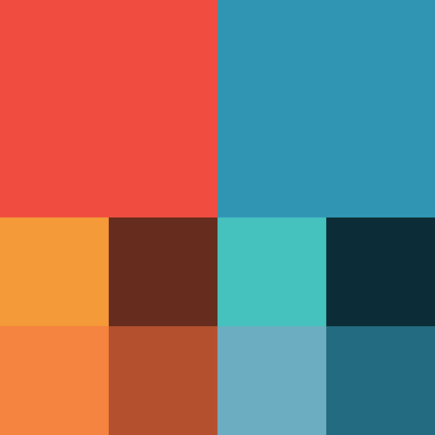
As a speculative project, not departing too drastically from the established color palette made sense. There were areas for improvement however. Orange is a middle value that can pose problems when used for type over certain background values. The primary orange was changed to a darker red-orange that displays better on mid to light backgrounds. The teal blue was carried over as is. Monochromatic options where identified for each color to provide options when displayed on dark backgrounds.