Ornamental Signage
Aisle signage developed for big-box retailers.




Objective
Ornamental wanted to be viewed by their big box customers as a respected authority in their industry. Ornamental presents in-store sales programs to Home Depot annually. They are compared to select competitors vying for limited contracts to sell through Home Depot. Being viewed as the category leader is advantageous in winning those contracts.
The Home Depot category management team’s critiques of Ornamental’s merchandising materials rarely yielded substantial improvements. The materials were developed late in the process and tied to previous designs. Ornamental were stuck in a cycle of sub-par branded materials that weren’t being improved.
Challenge
They were struggling to improve their in-store presence because they didn’t appreciate the value in rebooting their branding. They didn’t look like an industry leader, instead they presented like a fly-by-night outfit.
The initial challenge they faced was understanding the deficiencies that existed. Secondly, they needed to proactively define and execute on a solution, as opposed to waiting for a scheduled line review and defaulting to the old sub-par materials.
With a Home Depot Canada review anticipated later in the year, the Ornamental team were eager to right previous missteps and cement their preferred vendor status.
Approach
During early planogram preparation the team was finding it difficult to arrive at a solution that afforded the necessary variability across in-store bay sizes. Established product card dimensions and their placement was limiting planogram options. But what if it didn’t have to? The team was open to exploring that question, which also opened the door to improved categorization and overall aesthetics.
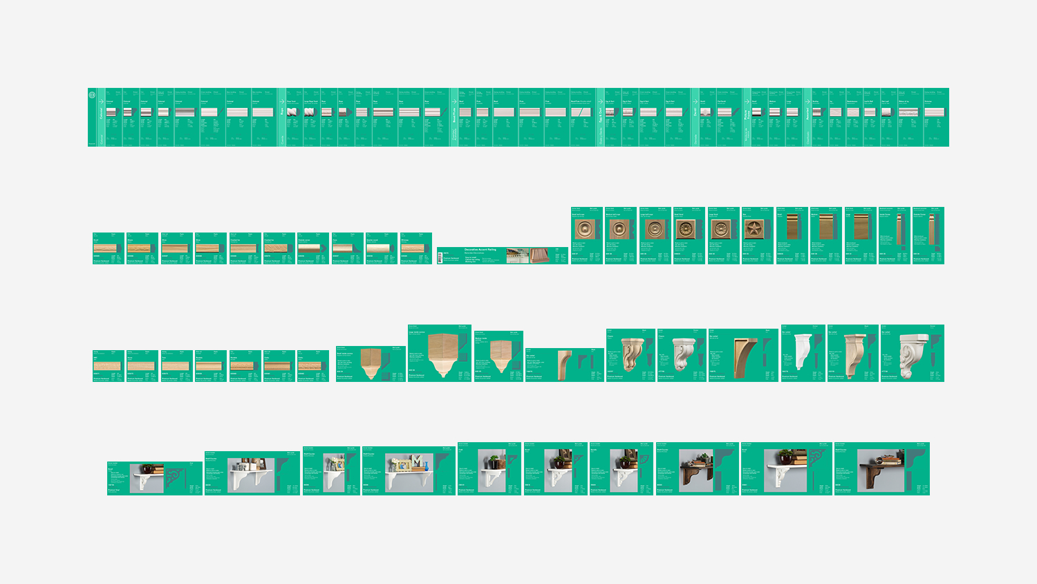
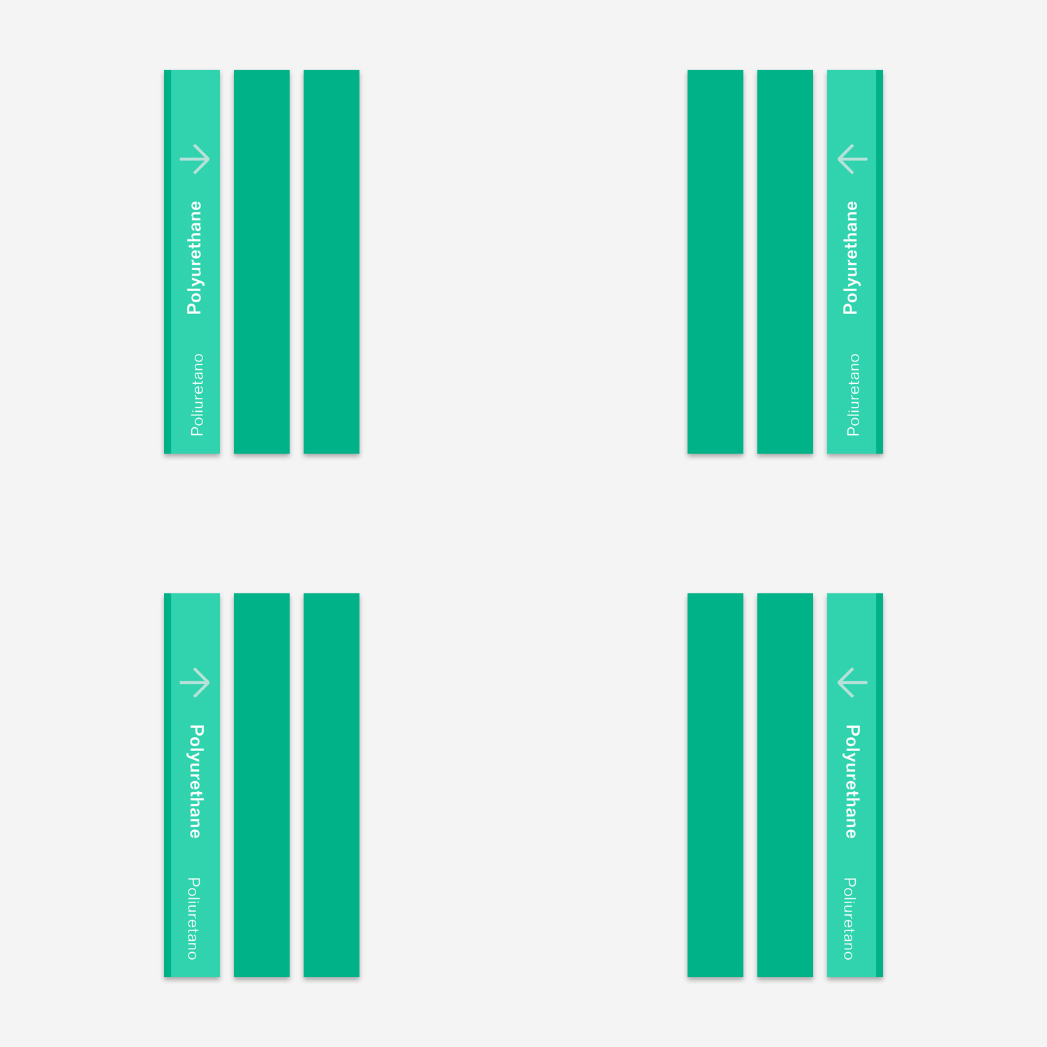
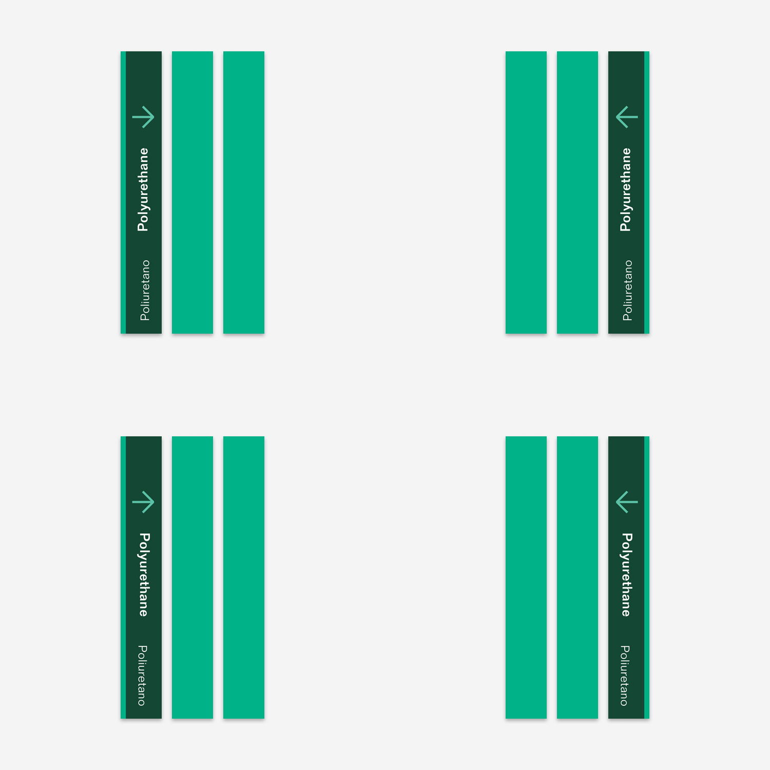
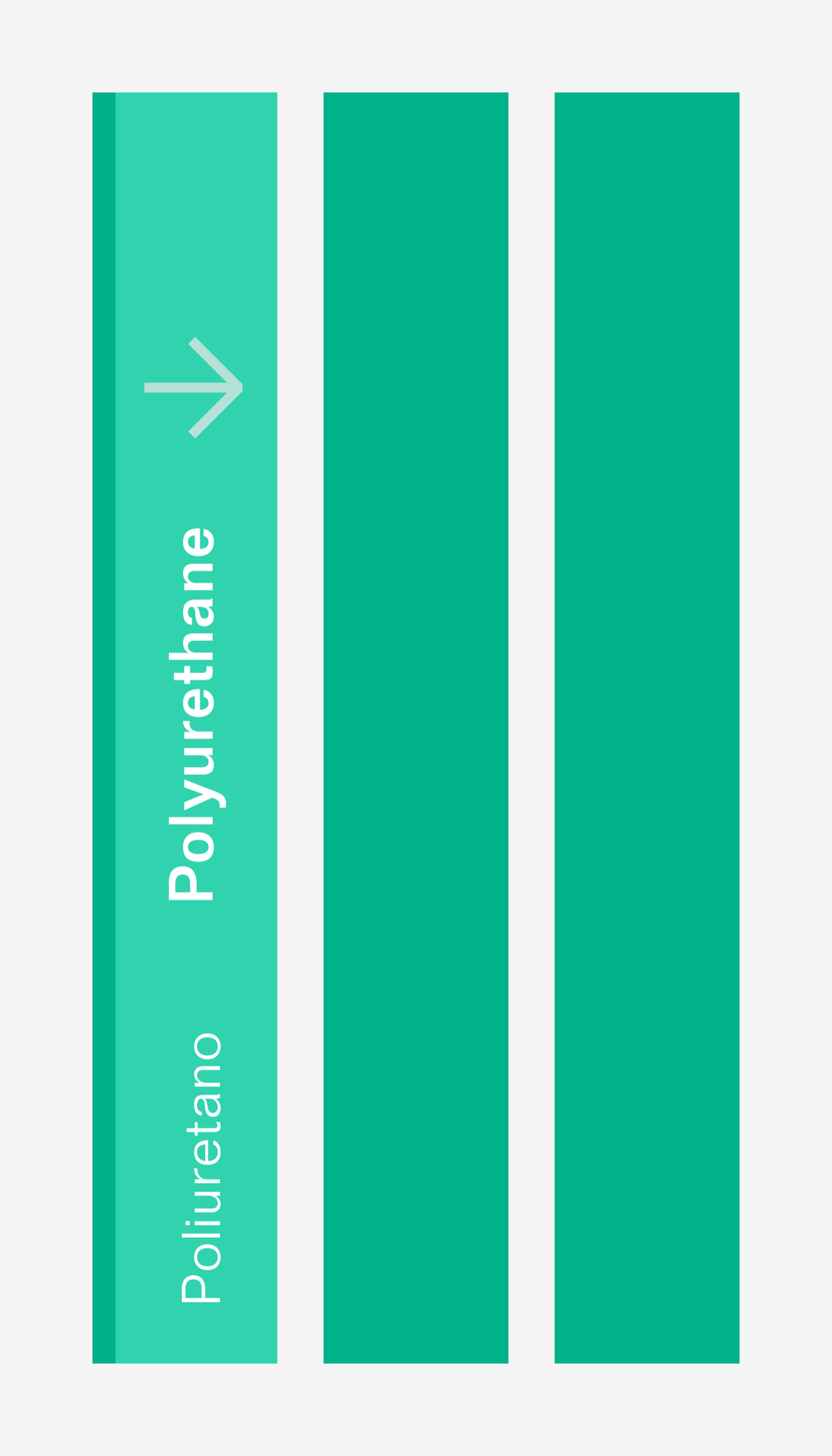
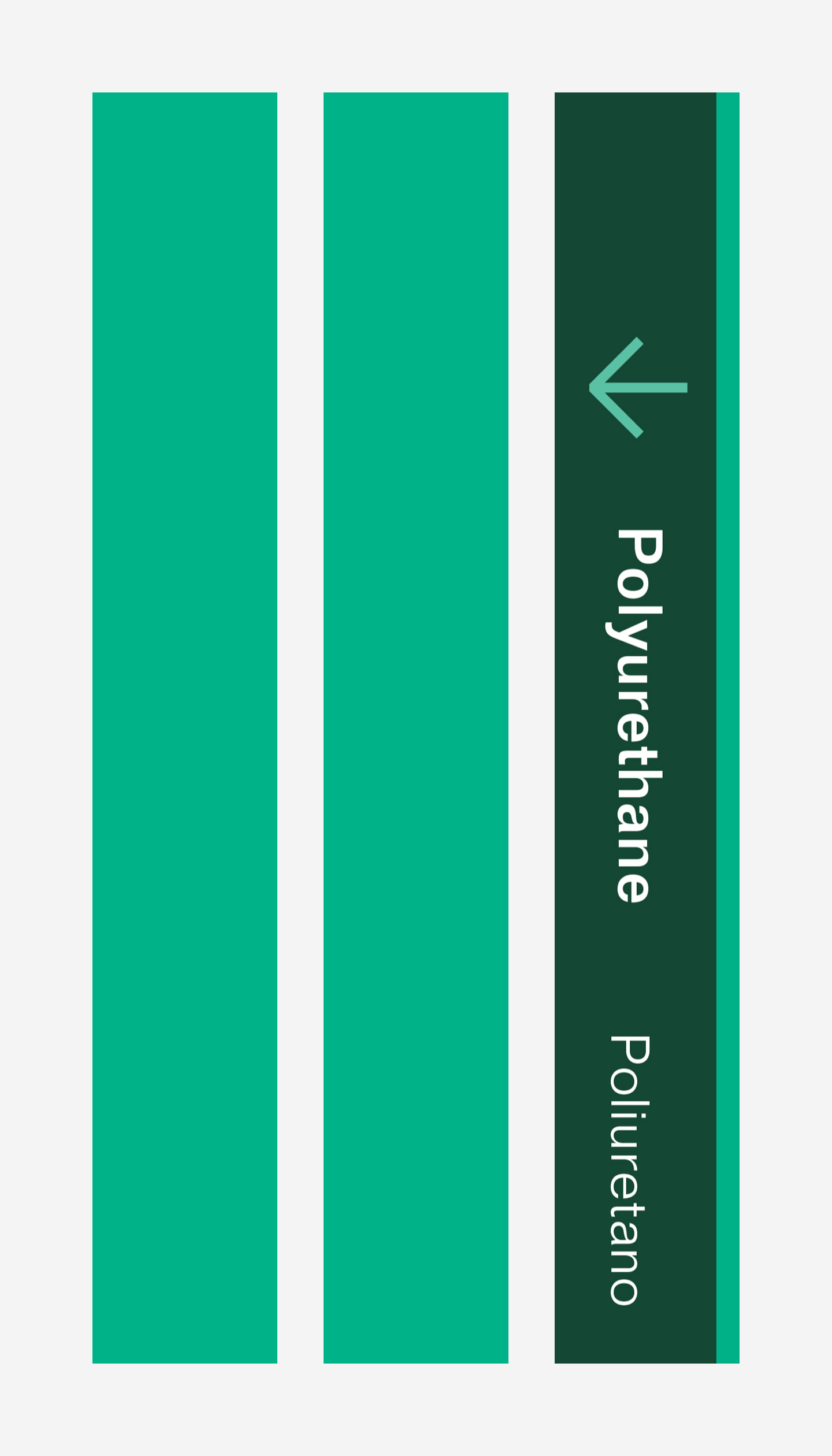
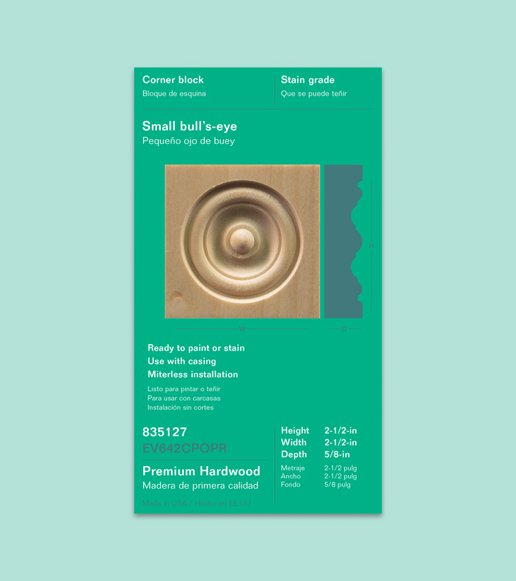
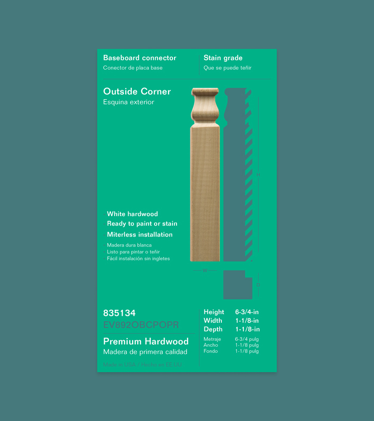
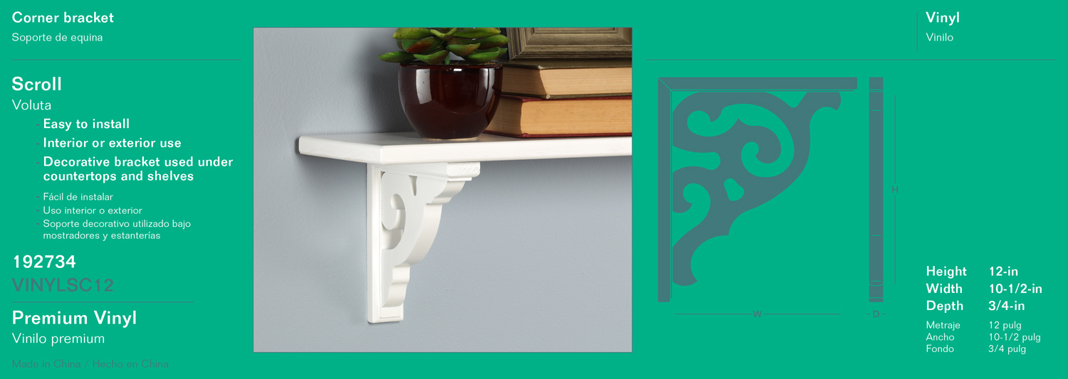
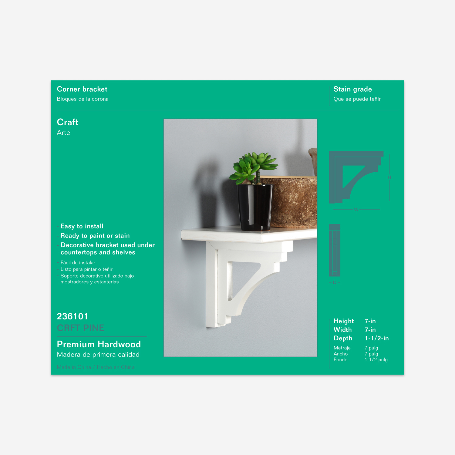
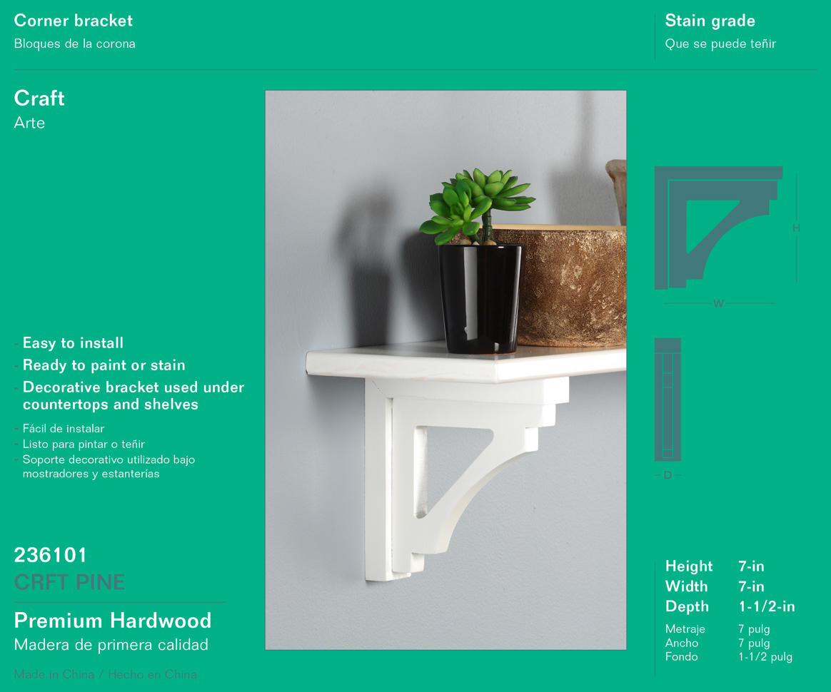
Enter a new modular strategy utilizing product cards in multiple widths of 1″, 2″ and 3″. As well as 1″ categorization cards and a 1″ Ornamental branded card. This solution maintained flexibility for varying planograms, allowed for categorization, and maximized the available bay width. Maximizing the space in the c-channel ensured consistent card placement and a cleaner presentation.
What we achieved
The sales and supporting team members loved the flexibility of the modular cards. Duplicate width card sets ensured any planogram could be executed, even for an occasional incorrectly sized bay.
Previously, narrow product cards were needed by a few small bays but used across the majority of regular bay widths. This resulted in vacant space and uneven placement. The new cards always fill the available space and are easier to align. This yielded a consistently clean and organized appearance.
Home Depot loved the opportunity to include categorization. Their Category Managers spend a great deal of time on taxonomy, product definitions and in-store wayfinding. That categorization often stops at individual vendors. This approach created a synergy with their overarching structure. It also served as a foundation for discussing the discretionary design decisions—ultimately allowing for easier buy-in.
The Category Managers took inspiration from Ornamental’s bay design and worked to standardize it across in-aisle vendors. Ornamental was recognized for their leadership and maintained their preferred vendor status.
Client
Ornamental specializes in ornately detailed wood products utilizing a vast library of decorative patterns, hence the name “Ornamental.”
They have been at the forefront of the decorative moulding industry, establishing brand recognition around the name Ornamental Mouldings. Later expanding into non-moulding products (specifically storage solutions) prompted the creation of a second brand designation “Ornamental Products.”
Deliverables
- 1 Creative strategy
- 2 In-store product signage
- 3 Modular product cards
- 4 Planogram logistics
- 5 Product photography